Brand Book
In 2021, we had an important conversation as a brand team about brand book. We had been working for the last 2 years on an ongoing rebrand, and had yet to create a brand book for the team and the company. This was an important project for us to accomplish and took all hands on deck to complete.
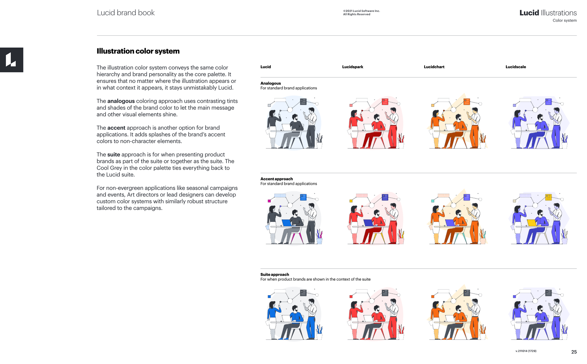
As the Lead Illustrator at Lucid, I took on the sections about illustration. Since we are a suite of products, the most important part of this project was creating a cohesive color system for Suite level, Product Accent Colors, and Analogous. With the illustrations, I figured out how to best apply these color systems to our illustrations and create rules on what to do and what not do. Along with color rules, I also established other rules within the illustration system to help people understand easily and effectively execute their illustrations in a way that was on brand.
Brainstorming
In preparation for putting the illustration sections together, I spent some time researching and brainstorming on what has been done over the last few years with our illustrations. This included pulling examples from past work and pointing out what was working and wasn't working, and then write rules around those. I then spent time writing down a bunch of rules and suggestions that would potentially be in the brand book. I met with the Creative Director to go over some of these and we then picked out the most important ones that we felt like gave a good understanding to how our illustrations work and what rules and guidelines would support that.
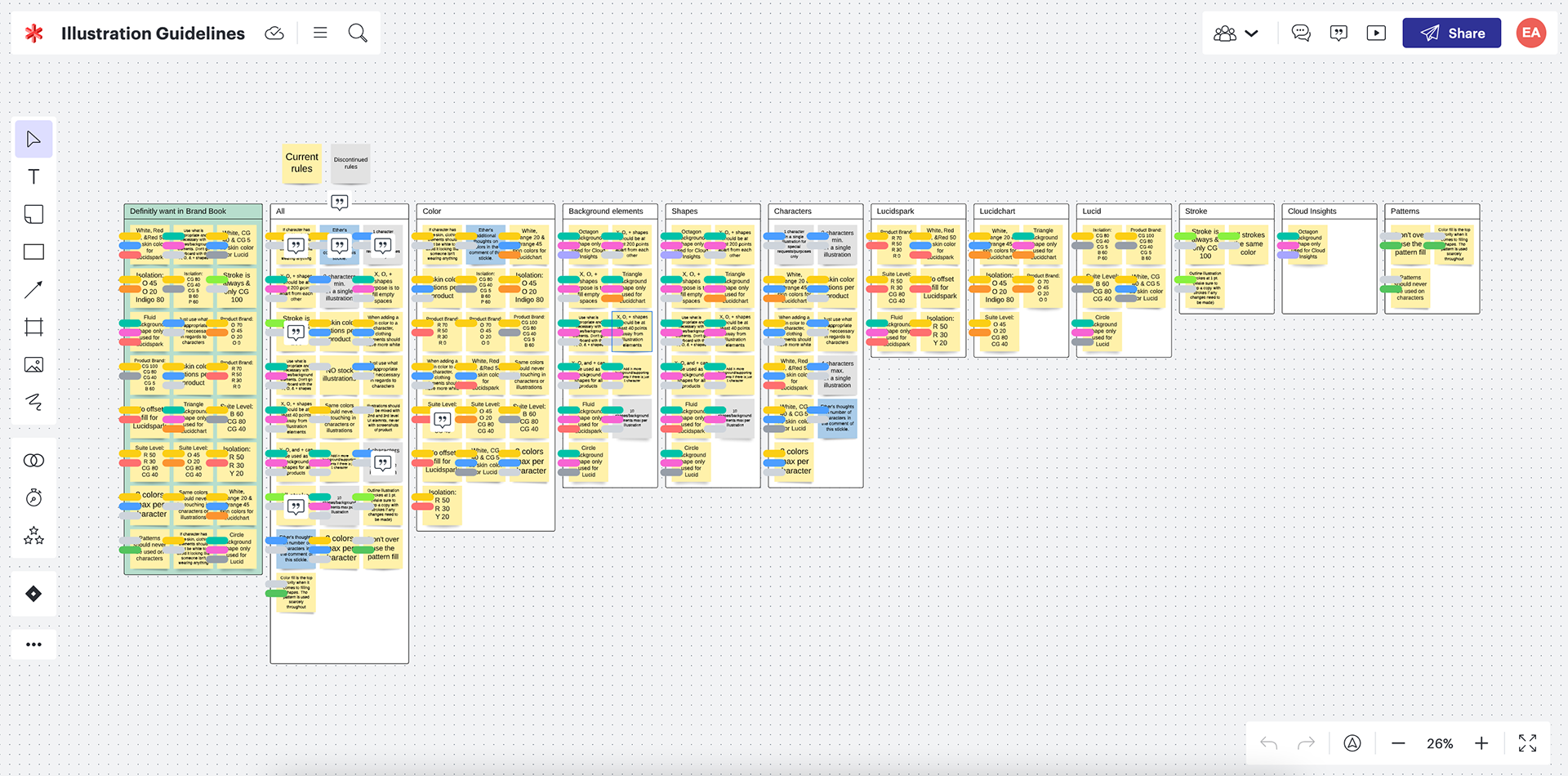
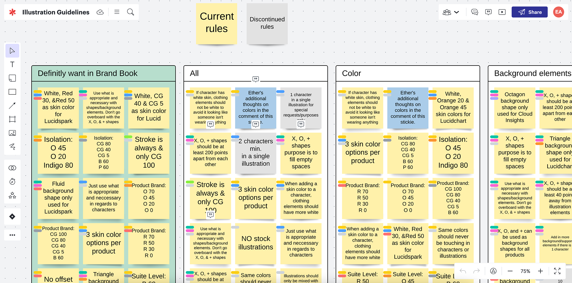

Illustration Sections
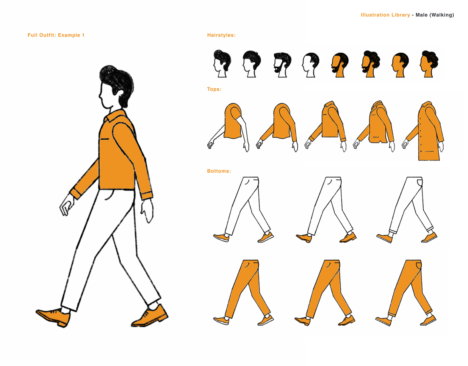
I pulled the Lucid illustration section from the brand book to show an enlarged version. However, this application was done for all 3 brands. If you would like to see the other 3 brands, you can view the brand book above.
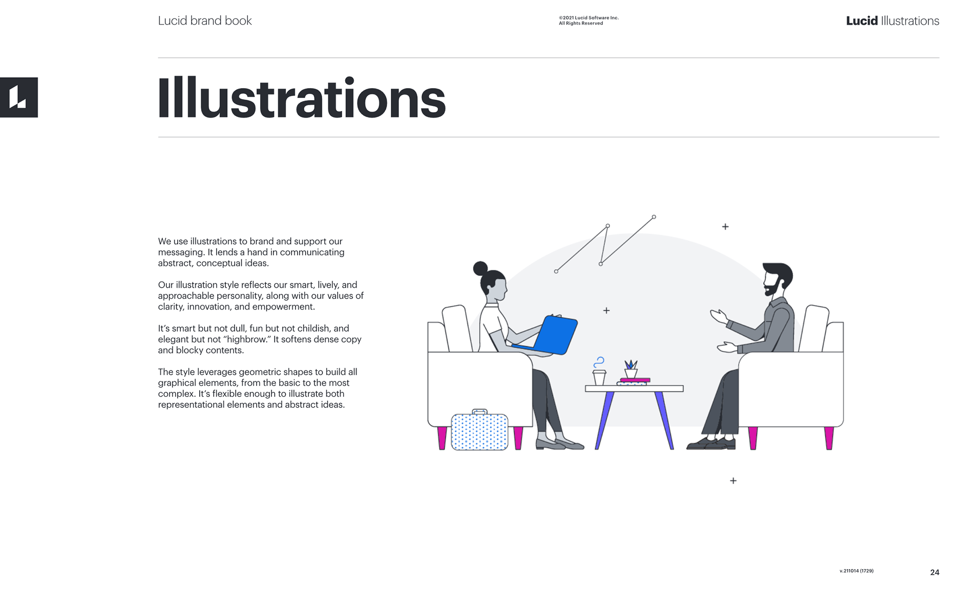
We use illustrations to brand and support our messaging. It lends a hand in communicating abstract, conceptual ideas.
Our illustration style reflects our smart, lively, and approachable personality, along with our value of clarity, innovation, and empowerment.
It's smart but not dull, fun, but not childish, and elegant, but not "highbrow." It softens dense copy and blocky contents.
The style leverages geometric shapes to build all graphical elements from the basic to most complex. It's flexible enough to illustrate both representational elements and abstract ideas.
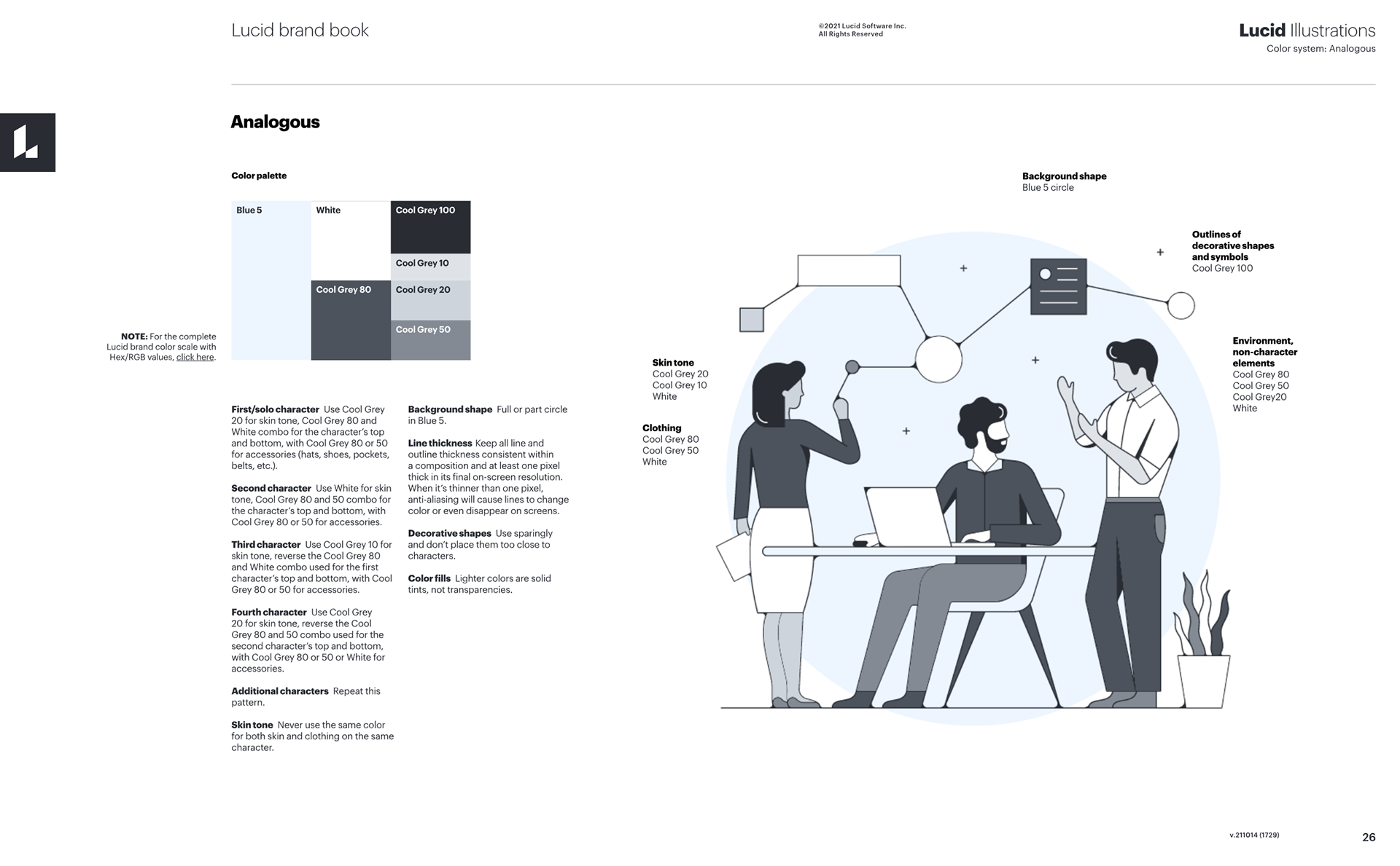
Analogous
The analogous coloring approach uses contrasting tints and shades of the brand color to let the main messaging and other visual elements shine.
The analogous coloring approach uses contrasting tints and shades of the brand color to let the main messaging and other visual elements shine.
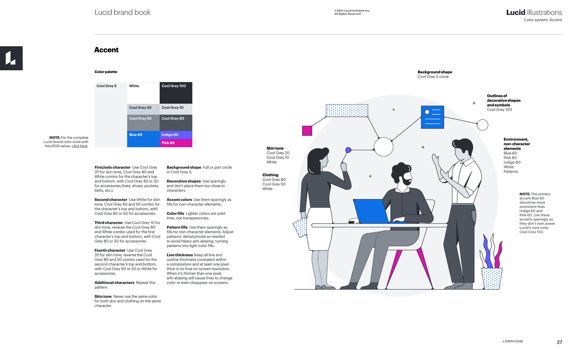
Accent
The accent approach is for another option for brand applications. It adds splashes of the brand's accent colors to non-character elements.
The accent approach is for another option for brand applications. It adds splashes of the brand's accent colors to non-character elements.
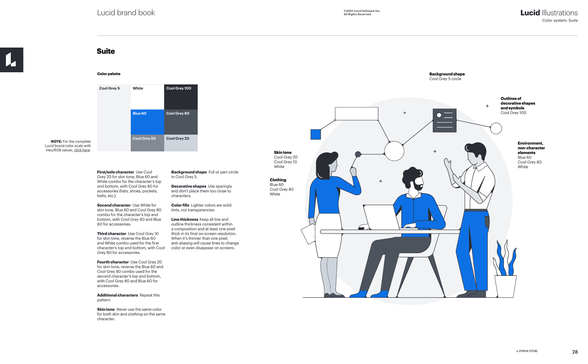
Suite
The Suite approach is for when presenting product brands as part of the suite or together as the suite. The Cool Grey in the color palette ties everything back to the Lucid Suite.
The Suite approach is for when presenting product brands as part of the suite or together as the suite. The Cool Grey in the color palette ties everything back to the Lucid Suite.